The Palette of Teresa Oaxaca

I have been working with Rublev Colours Artist Oils for several years. So much so that my palette is nearly entirely comprised of their colors, and for my students, you can buy the colors on the palette that I use in my workshops from Natural Pigments. This is for students who wish to use my full or limited palette.
Basic Palette
Ultramarine Blue (Green Shade)
Antica Green Earth
Lemon Ocher
Chrome Yellow Primrose
Lead-Tin Yellow Dark
Orange Molybdate
Pozzuoli Red
Vermillion
Alizarin Crimson
Cyprus Umber Raw Dark
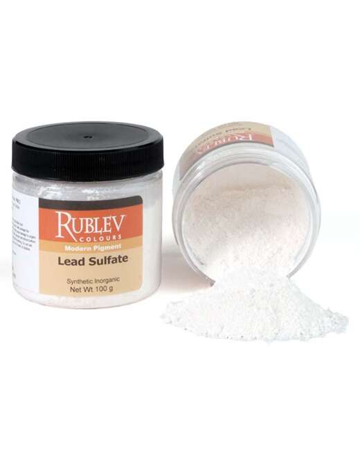
Lead White #1
Bone Black
Extended Palette
Maya Blue
Cobalt Chromite Blue
Verona Green Earth
French Umber
Mediums
Oleogel
Epoxide Oil
Aged Refined Linseed Oil
Rublesol (odorless mineral spirits)
Order the |
The list of colors and materials is integral to my working palette. It has been selected for fast drying time so that your progress in the workshop may run smoothly without the added difficulty of having to work over still-wet or tacky paint. You will notice many earth colors, numbers, and lead pigments. The oils that bind these pigments and that will be used as a medium also exemplify quick drying times.
I paint on both canvases and panels. Medium to smooth weave is preferred, but bring what you are comfortable with. I prefer Claessens oil-primed linen rolls and then stretch them myself. At other times, I use Artefex oil-primed linen on ACM panels, which are available through Natural Pigments. Though these are more expensive, they are archival and give great painting results.
My palette has been getting brighter and larger (in comparison, see my earlier palette below). This is partly due to all of the colorful props I now paint, such as flowers and fabrics and face paint, but also a change in style from tenebrism to a more direct approach where glazing is not the object. Thus heavier colors are needed to support the more dramatic light effects.
It’s also due mainly to my visits with George and Tatiana O’Hanlon, Natural Pigments paint factory, their Painting Best Practices workshops, and their general willingness to discuss the art of painting everywhere and anywhere in depth. Whether in a refined sprawling vineyard or a small casual winery, in the redwoods, at one of the Portrait Societies of America (wherever those happen to be), or at their home and factory, they are ready with enthusiasm, humor, and deep knowledge and appreciation of the craft.
For example, the importance of lead white and lead colors has become more apparent. They form a more robust paint film throughout each painting layer and speed up drying, so you don’t get as much sinking in. They also look better, or I should say they get you that Antonio Mancini or Titian frothy white look easily and without fussing if that is what you are after. Generally speaking, they are less opaque and can be more easily mixed with other colors to make appealing flesh tones, for example. I used to hold on to my titanium white when I wanted a more opaque white until I learned that titanium white was not good for paint layer formation (not as flexible as lead white). For my classes, I recommend Rublev Colours Lead White #1 because it contains linseed oil instead of walnut oil, which means it will dry faster. It’s not a great idea to paint over a wet painting the next day.
But why stop there? There is also Lead-Tin Yellow Dark and Orange Molybdate, which also dries fast and forms strong films. Orange Molybdate is an extraordinarily bright color that could be your substitute for Cadmium Red Light, not that anything is wrong with it. I am just trying to put this relatively little-used pigment into perspective.
Naples Yellow is a fantastic color and is more traditionally used in modern art classes than Lead-Tin Yellow Dark (which I have on my materials list). In truth, I keep both of these pigments on my palette and a Naples Yellow Dark. But I didn’t want to make students go out and buy too much at the start, and it’s not necessary. Those are my working methods. In school, I had a much smaller palette that I stuck with and only began expanding gradually.
The other reason I don’t list Naples Yellow is that Chrome Yellow Primrose is there, and it is even brighter, so we have that base covered. With this and blue, you can mix most of the bright “acid greens” you will need, but that isn’t likely to be found in the flesh palette.
Antica Earth Green is a color I often turn to for just about everything. I like Antica Green Earth because it is natural and not synthetic. I can feel the crumbly texture of the pigment particles under my brush as I paint, and I like to vary that with finer particle-size pigments, such as lead white. Its medium tinting strength makes it great to throw into halftone mixtures, sometimes wet-into-wet and mixed on the canvas, and not done with a palette knife ahead of time on the palette as you might with an Alizarin Crimson. It’s also a nice lower chroma green. If I want a keyed-up green, I mix one with yellow and blue.
Pozzuoli Red is another color that is very familiar to painters. Venetian Red is one of the closest replacements. I used to use a Venetian Red by Rublev Colours, but after visiting their factory and seeing a batch of Pozzuoli Red being made (shown below), I brought home a tube and have been using it instead. It’s slightly warmer.
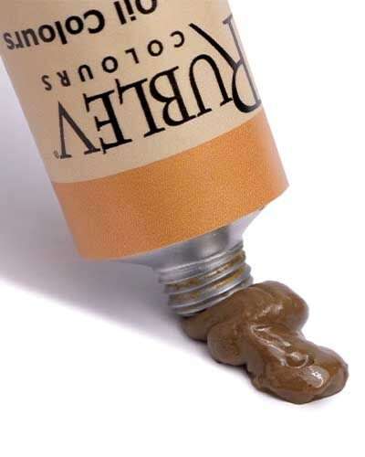
Ultramarine Blue Green Shade is another classic color that can be easily replaced with another brand’s ultramarine blue if needed. Except that I have never encountered a blue like this one. Ruble Colours Artist Oils do not contain additives, so the color’s natural consistency lends Rublev Colour Ultramarine Blue Green Shade its unusual characteristics over other brands of ultramarine blue. It is honey-like and ropy, extremely stringy and long, and harder to spread (you might need bristles for that), but a joy to blend and manipulate. One of the colors got me interested in the possibilities of grinding my paints and then choosing my binder medium.
Lemon Ocher is a version of yellow ocher, a color that most people are familiar with. Again Rublev Colours are natural, not synthetic, iron oxides, so their yellow ochers all have very individual characteristics (they all come from different mines around the world). I chose this one because it felt light and creamy, almost like whipped cream. It was also brighter.
Alizarin Crimson is a very high tinting color that I use mainly in my darks and for giving a reddish hue to dark pigment mixtures. I try to use it sparingly, so a little will go a long way on the palette. I don’t have much more to say on it without getting into a discussion about lightfastness, but as this is about class supplies, I would like to encourage students to use lots of paint in general. Put a lot on the palette and don’t spare it in mixtures; even though it might seem very expensive or wasteful, it is not, and you will also be doing yourself a favor in the long run in terms of what you accomplish and learn. Additionally, take heart! For most mixtures and paint mileage, you will probably use earth colors and umbers like I do and spare the more expensive pigments for highlights, tinting, and accents.
Cyprus Raw Umber Dark is a fantastic color. I formerly used a generic raw umber that was synthetic, sunk in… and devoid of texture. The raw umbers I recommend hurdle over all of these issues. The French Raw Umber is probably closest to the other raw umbers you will find on the market and is the one I am most familiar with using. And it is a lovely color with coarse pigment particles and acts similarly to Antica Green Earth. Meanwhile, the Cyprus Raw Umber Dark is super dark, almost black, and smooth and has been great for getting deep shadow colors without having to resort to too much black. Throw some Ultramarine Blue in instead, perhaps.
Of course, nothing is wrong with black. I am not one of those painters who recommends entirely leaving black off the palette. But I try to avoid reaching for it just because it is dark. Bone black is one of the darkest ones you will find and is cold black. Black does dry slower, however, and so sometimes I like to throw some Orange Molybdate in with it to make it warmer and dry faster. Or I put in Ultramarine Blue, Alizarin Crimson, etc. These are all great colors for tinting your black without getting the chalkiness in it, which might not make it look as deep. There I go giving all the secrets away; oh well—old tricks, nothing new.
Now Maya Blue is a great new color and has been made available to painters again recently. It was never on the Western Art palette since it was used by the Mayans using clay and indigo to create this lovely color synthetically. It’s a bit like an earth blue, meaning that it does not have as high a chroma as other blues might, and it also goes dark which I love. This is part of my extended palette, meaning you don’t have to bring it to class.
Cobalt Chromite Blue is a pigment name that I am just getting used to saying. It’s only been on my palette for a few months, and I loved it instantly. I think I was one of the first to try it out because I got it from the factory with a smiley face drawn on the back of the label instead of the pigment facts, tubing early at my request. Cobalt Chromite Blue is what I used to think of as Cerulean blue. It has a lovely hue and powerful tinting strength. This one comes darker than many Cerulean blues I was used to working with. This is also on my extended palette, optional. I guess I like having lots of paints…
The following optional color is Vermilion, a gorgeous and historic red. One of its appeals is that it can be mixed with many other colors on the palette, and you get greys and lavenders and not as much brown or orange. It reacts/mixes differently with other pigments than cadmium red, which takes some getting used to. It has replaced cadmium red on my palette for the time being. I was curious to see what would happen if I coordinated my palette with a more natural set of paints found on older canvases I admired. It is optional, but please bring cadmium red to class if you don’t get it.
Verona Green Earth is a higher chroma green that I like to have on my palette and reach for instead of mixing up my own green all the time. It’s optional.
Teresa Oaxaca’s Former Palette
This palette (see below) is from a portrait painting demonstration at the 2015 Portrait Society of America Conference. I prefer to lay out my colors from light to dark and warm to cool so that I get to what my eyes look like a harmonious display of hues. The important thing is that I have gotten used to this arrangement so I can send my brush or palette knife to the appropriate pile for mixing without having to think about it too consciously, thus freeing up my mind for drawing and value work on the painting.

On my palette are the following colors in order counterclockwise:
Crystal White—Rublev Colours
Lead White No. 2—Rublev Colours
Naples Yellow—Rublev Colours
Cadmium Yellow Medium—Rublev Colours
Orange Molybdate—Rublev Colours
Vermillion—Rublev Colours
Cadmium Red Deep—Rublev Colours
Venetian Red—Rublev Colours
Alizarin Crimson—Rublev Colours
French Burnt Sienna—Rublev Colours
Transparent Oxide Yellow—Rublev Colours
Verona Green Earth—Rublev Colours
Antica Green Earth—Rublev Colours
Viridian—Rublev Colours
Ultramarine Blue (Green Shade)—Rublev Colours
Cobalt Blue—Rublev Colours
Diyoxazine Purple—Windsor & Newton
Cypress Umber Dark—Rublev Colours
French Raw Umber—Rublev Colours
Bone Black—Rublev Colours
I like to work on oil-primed canvas, which does not necessarily have to be pre-toned. In the past, I have used a dry, warm brown, or cool grey mid-tone preparation. However, I came upon the method that I use now by accident. When beginning an alla prima painting or one-day sketch, I prefer to rub raw umber, paint a medium heavy wash over the entire canvas, and start working directly into that application. I can rub out my lights easily and not commit to sharp lines in the beginning stages that would distract me later. This method also helps me to work in terms of mass, using light and dark to sculpt the features broadly. I don’t stay at this stage or bring it to a great sense of finish either; after about half an hour or one sitting, I am ready for color.


Using color on a slightly wet and raw umber-toned surface also has the advantage, at least for me, of giving my paint something to work into and “overcome.” I key my lights and chromas very high, and the slightly swampy underpainting brings them back down to earth and gives all the colors a unity that is only apparent when I compare the work to another similar pose done straight onto a dry surface. See the comparison in the following few images.

This is a picture of the Impression of a Lady (16x20 inches, oil on canvas, sold) taken while she was still fresh on the canvas. You can see what I mean about some of the earth color blendings, particularly in the tuft of hair on the left coming down from her wig. The blue background in that section is muted considerably by the still-wet underpainting and has led to some unexpected effects that I liked and let remain.
There was a sense of fighting with the canvas and living with the unknown, a bit like watercolor.

White Collar (16x20 inches, oil on canvas, sold) was painted over a dry, grey, toned canvas. Comparing my works in hindsight, I have noticed the relative crispness and control of the brushwork, perhaps a lack of unpredictability. I used to prefer this and, at one time, would have shrunk away from anything that would muddy my colors and make mixing and painting even more unpredictable and complex. I used shorter, stiffer brushes, more blending, and less texture; now, I welcome a bit of this brush play and seek out long Egbert-style* bristle brushes, economy hog bristle brushes, and more exciting paint.
Rublev Colours oil paints are pretty interesting for many reasons. One is that they have different pigment granular sizes, which is the natural way to experience and handle paint. For example, Cyprus Raw Umber Dark has substantial particles, and I can almost feel it grinding against the canvas. On the other hand, Ultramarine Blue (Green Shade) has a honey-light consistency and a very long flow. The lead whites, of which they produce several, are all good for different things like achieving more texture (such as Ceruse which has chalk in it) or transparency and brilliance (which the leaded crystal glass in Crystal White lends). Lead White No. 2, bound with walnut oil, extends lead white’s somewhat short drying time, which I am grateful for because I can take the entire day and night to complete a passage. Or in other cases, I like the option of Lead White No. 1 bound in linseed oil if I want faster drying time.
See the entire color range of Rublev Colours Artist Oils. |
I have learned from sitting down with George O’Hanlon and Tatiana Zaytseva (Rublev Colours paint makers) that this behavior is more characteristic of pre-twentieth-century oil paints. Pigments have ways of “behave,” and it’s not natural or necessarily desirable to force them all to the same consistency as in modern commercial paints. Someday I would like to take one of their Painting Best Practices Workshops, where they discuss the science and correct methods of preparing surfaces and paints and their use.
It is safe to say that I do not use every color on my palette in every picture. The larger and more involved the picture tends to be, the more paints get used. When I started painting, I had a set palette of mostly umbers and not more than ten colors. This worked for figures in model rooms and darkly lit still lifes and for a time in my studio. As I started to add more flowers and experiment with colors in my compositions, my palette grew to encompass what it is today. I could have stopped adding colors a while ago, and it would have been fine. Still, my curiosity about paint handling effects and new pigment behaviors and mixtures (as well as wanting sound and reliable paints) intrigues me about Rublev Colours.
For example, Orange Molybdate is a recent addition to my palette. It contains lead molybdate and has a very high tinting strength. While warmer than Cadmium Red, it could be used to replace it if it is mixed with Alizarin Crimson, for example. It provides an excellent range of mixtures. I used it on the doll and the red stripes on the frame (see picture below).

* The Egbert brush is a filbert, but with longer hair. It has the advantage of holding more color and more easily flexes. Its relationship to a filbert is like that of a flat to a bright.

Learn more about Teresa Oaxaca and her art at her website.


