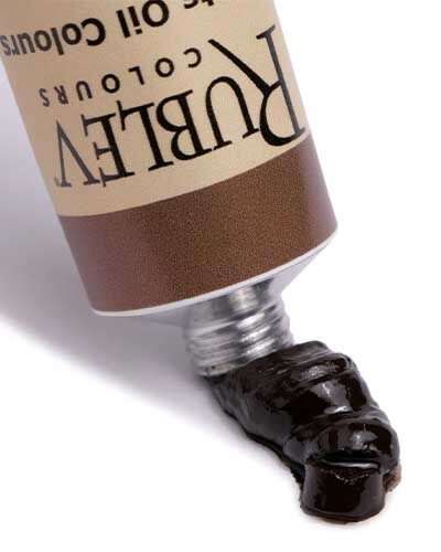
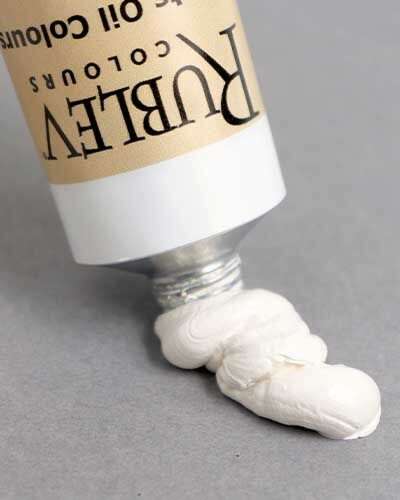
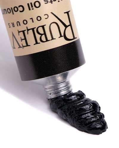
Baroque art, originating in early 17th-century Europe, is characterized by dramatic expression, rich, deep color, and intense light and shadow. It often focuses on tension, movement, and emotional intensity, with an emphasis on realism and detail. This style often reflects grandeur and luxury, aiming to evoke emotional responses from viewers.
Old Masters Palette: Caravaggio — His Baroque Palette and Technique

Caravaggio’s Mastery in Technique and Palette: A Fusion of Ground Preparation and Color Application
Caravaggio, a quintessential figure of the Baroque era, not only revolutionized the artistic world with his dramatic chiaroscuro and a distinctive color palette but also demonstrated a profound understanding of the relationship between ground preparation and color application.
Michelangelo Merisi da Caravaggio (born 1571, Milan or Caravaggio; died 18 July 1610, Porto Ercole) was the most radical painter in post-Tridentine Italy. In his religious and mythological compositions, he mocked classical Roman tradition by depicting his models in an unidealized, naturalistic style. In this article, we examine how ground preparation played an important role in his painting technique, as did the colors he used on his palette.
The Evolution of Ground Preparation
The evolution of canvas supports on strainers and stretchers in the 17th century highlighted the importance of ground preparation in oil painting. Artists, including Caravaggio, perfected their methods, combining priming and preparation into a single colored oil layer. This layer, often a mix of clay, linseed oil, and colored pigments, known as mestica, became integral to their technique. Caravaggio’s method involved a dark ground preparation, typically in red or brown, enhancing the depth and chromaticity of colors like blue, green, or white when applied atop. Over time, this approach intensified the tonal contrasts in his works, contributing to his signature dramatic effect. However, the increasing transparency of oil paint, over time, can cause the painting over dark grounds to absorb ha lf-tones and reinforce shadows, exasperating the tonal contrasts of the painting.
It is frequently mentioned that Caravaggio worked intentionally with the color of the ground when creating his canvas paintings. While gray grounds can be found in some of Caravaggio's early paintings in Rome, most of Caravaggio's paintings have a red-brown, somewhat translucent ground that he came to utilize in a very particular manner; he left the ground visible in the half-tones.
After the mid-1500s, it became increasingly usual to find canvas paintings featuring colorful primers or grounds blended with earth or other opaque pigments. Although these grounds somewhat diminish the highest level of luminosity achievable through the use of transparent colors over a white background, they establish a mid-tone foundation. This foundation enables artists to adeptly navigate both the lighter and darker values in their work. The result is a swift three-dimensional effect achieved with minimal brushwork; showcasing pronounced chiaroscuro effects that were highly favored in that era.

The Supper at Emmaus, Michelangelo Merisi da Caravaggio, 1601, oil and tempera on canvas, 141 × 196.2 cm (55.5 in × 77.2 in), National Gallery, London, NG172
Caravaggio’s Direct Approach to Painting
Contrary to common practice, Caravaggio reportedly painted directly in color, foregoing preliminary drawings. X-ray investigations revealing frequent pentimentos support this. He often used freehand incisions on the preparation layer to mark the cardinal points of his composition, as observed in various works. This technique likely evolved from transferring drawings using cartoons, which was nearly exclusive to Caravaggio. His choice of a dark, reddish-brown preparation is a notable characteristic, which he sometimes allowed to shine through the painting, adding depth and intensity to his works.
Recent studies, like those on The Supper at Emmaus, reveal that Caravaggio might have used preliminary graphic outlines, contradicting earlier beliefs. His process involved creating a graphic trace with burnt umber, over which he painted with rapid, confident brushstrokes, integrating the sketch and painting in a singular process. This approach, known as “impasto a corpo,” involved building the painting with the paste of the color rather than in layers.
Technique of Overlapping and Detailing
Caravaggio’s unique method of constructing his paintings involved executing figures as a whole, starting from the background and then adding foreground elements. This technique resulted in an overlap of elements, such as hair over foreheads or arms under sleeves. His rapid final drafts often merged with the initial sketches, with occasional egg tempera highlights added atop fresh oil layers. Despite the energetic brushwork, Caravaggio maintained an extraordinary attention to detail, often using a very thin brush for finer elements.
As noted by Pietro Bellori in “Le vite de’ pittori, scultori et architetti moderni,” Caravaggio used every capability of his brush, working with such pride that he left the canvas priming in mid-tones. The painter then revisited the reddish preparation with a light brown or black glaze, creating a dark background that sometimes overlapped the figures’ contours.
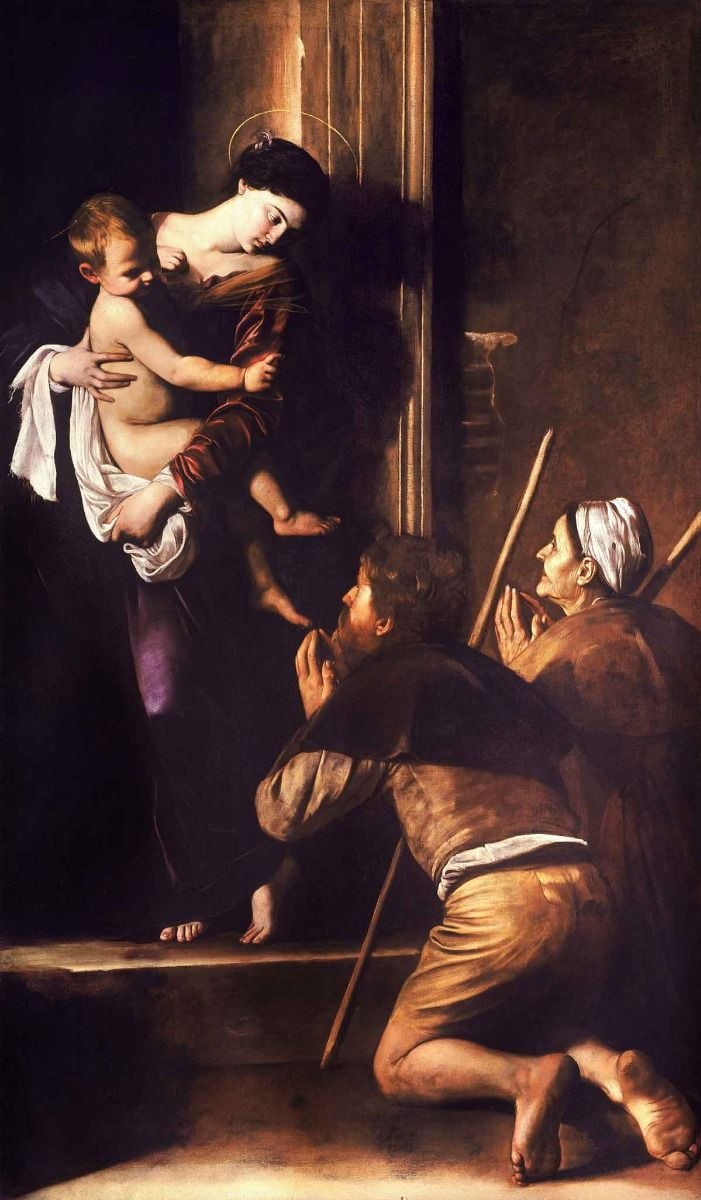
Madonna of Loreto or Pilgrim's Madonna [Italian: Madonna dei Pellegrini], Michelangelo Merisi da Caravaggio, c. 1604-1606, oil on canvas, 260 cm × 150 cm (100 in × 59 in), Sant’Agostino, Rome
Caravaggio’s Palette
Although “chiaroscuro” was practiced long before the 17th century, Caravaggio made the technique definitive, darkening the shadows and transfixing the subject in a blinding shaft of light. He achieved this effect with a limited palette typical of 17th-century painters: iron oxide earth colors (red ocher, yellow ocher, umber), a few mineral pigments (vermilion, lead-tin yellow, lead white), carbon or bone black, and verdigris. Earth pigments predominated, and brighter colors were always veiled.
Caravaggio’s palette, which had become significantly darker in his last works in Rome (such as the Madonna di Loreto altarpiece in Sant’Agostino of 1605–1606), now restricts itself almost exclusively to a simple, nearly monochromatic array of dark earth tones and silvery whites. The occasional flash of red or yellow nearly jumps off the canvas. Caravaggio’s brushwork is now noticeably looser, and his models—poor, rough types culled from the Neapolitan streets—are more realistically described than ever before.
Caravaggio’s palette was a testament to his pioneering approach, comprising a relatively limited yet highly impactful range of colors. Central to his palette were earth tones, which were the bedrock of the Baroque school’s inclination towards realism and emotional depth. His selection of pigments included:
Lead white
Lead-tin yellow
Yellow ocher
Verdigris
Vermilion
Red ocher
Umber
Bone black
![The Calling of Saint Matthew [Italian: Vocazione di San Matteo], Michelangelo Merisi da Caravaggio, 1599–1600](https://www.naturalpigments.com/media/wysiwyg/The_Calling_of_Saint_Matthew-Caravaggo__1599-1600__small.jpg)
The Calling of Saint Matthew [Italian: Vocazione di San Matteo], Michelangelo Merisi da Caravaggio, 1599–1600, oil on canvas, 322 cm × 340 cm (127 in × 130 in), San Luigi dei Francesi, Rome
Technique and Style: The Power of Chiaroscuro
Caravaggio’s signature technique was chiaroscuro, which he employed with unrivaled mastery. This technique involved a stark contrast between light and dark, creating a sense of volume and depth that brought his subjects to life. His adept use of shadows, often deepened with umber and carbon black, was counterbalanced by striking highlights achieved with lead white and lead-tin yellow. This interplay of light and shadow is vividly illustrated in works like The Calling of Saint Matthew, where the divine light dramatically illuminates the scene.
![The Entombment of Christ [Italian: Deposizione], Michelangelo Merisi da Caravaggio, 1603–1604](https://www.naturalpigments.com/media/wysiwyg/The_Entombment_of_Christ-Caravaggio__c.1602-3_small.jpg)
The Entombment of Christ [Italian: Deposizione], Michelangelo Merisi da Caravaggio, 1603–1604, oil on canvas, 300 cm × 203 cm (120 in × 80 in), Pinacoteca Vaticana, Vatican City
In his later works, Caravaggio’s palette became even more restrained, with a notable emphasis on dark earth tones and silvery whites. This evolution is evident in paintings such as The Entombment of Christ, where the somber hues reflect a deeper naturalism and an unidealized portrayal of the human condition. His brushwork in these later pieces became looser, further enhancing the naturalistic quality of his paintings.
Influence and Legacy
Caravaggio’s impact on the Baroque school cannot be overstated. His ability to convey emotion and drama through a selective palette and masterful lighting set a new precedent in art. His works influenced a generation of artists, the “Caravaggisti,” who emulated his style and techniques. His fusion of theatricality with realism paved the way for the emotive and dynamic character that defined the Baroque movement.
Through his innovative use of color and light, Caravaggio transformed the landscape of 17th-century painting. His legacy, marked by a distinctive palette and a profound understanding of human emotion, continues to inspire and captivate audiences, making him a pivotal figure in the history of Western art.
Modern Equivalents of the Colors on Caravaggio’s Palette
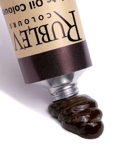
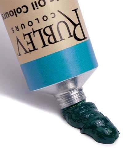
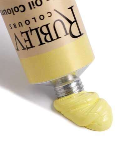
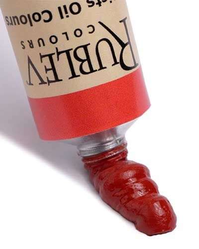
| Colors on Caravaggio’s Palette | Equivalent Colors in Rublev Colours Artists Oils |
| Lead white | |
| Lead-tin yellow | |
| Yellow ocher | |
| Verdigris | * |
| Vermilion | ** |
| Red ocher | |
| Umber | |
| Bone black | Bone black |
* Verdigris is not a permanent color known to darken and become brown over time. We suggest viridian as a reasonable substitute for verdigris.
** Vermilion is not available at the time of this writing. Cadmium red light is a good substitute for vermilion.
Notes
The term primer is used in the traditional sense to indicate the preparation of a surface to be painted with chalk or gypsum and animal collagen glue. This is to distinguish it from grounds or mestica, which are characterized by the presence of an oily component. Some early sources tend to use the terms “imprimitura” and “mestica” as synonyms, as documented by the references between the two entries in the vocabulary of Filippo Baldinucci (1681).
Derived from “mesticare,” to mix, in artistic literature between the 17th and 18th centuries, the term “mestica” was generally used as a synonym for preparation. In more recent times, it has been identified with a colored coating characterized by oil, clay, and pigments; it is quite distinct from the most ancient gypsum and glue preparation. In particular, the use of the mestica finds its meaning in the need for a less porous preparation for applying oil colors.
Giorgio Vasari (1550) defines mestica as a “compound of ground earths that is placed on the canvas or board to be painted,” and Filippo Baldinucci (1681) a “compound of different earth and colors ground with walnut or linseed oil to be applied to the canvases or panels you want to paint. “
References
David Hradil, Janka Hradilová, Giancarlo Lanterna, Monica Galeotti, Katarína Holcová, Victory Jaques, Petr Bezdička. (2020) “Clay and alunite-rich materials in painting grounds of prominent Italian masters – Caravaggio and Mattia Preti,” Applied Clay Science, Volume 185, 2020, 105412, ISSN 0169-1317, https://doi.org/10.1016/j.clay.2019.105412 (https://www.sciencedirect.com/science/article/pii/S0169131719304703)
Christiansen, Keith. (2014). "Caravaggio and “L'esempio davanti del naturale”. The Art Bulletin. 68. 421-445. 10.1080/00043079.1986.10788361.
Frequently Asked Questions
What are the characteristics of Baroque art?
What are the three most influential works of art from Baroque?
While subjective, three influential Baroque artworks include The Ecstasy of Saint Teresa by Gian Lorenzo Bernini, Judith Slaying Holofernes by Artemisia Gentileschi, and Las Meninas by Diego Velázquez. These works exemplify the dramatic, emotive, and technical mastery characteristic of Baroque art.
What are two characteristics of the Baroque style of art?
Two defining characteristics of Baroque art are its dramatic use of light and shadow, often referred to as chiaroscuro and its emotional intensity. Chiaroscuro creates a striking contrast that emphasizes depth and volume, while the emotional intensity is achieved through dynamic compositions, dramatic narratives, and detailed realism.


