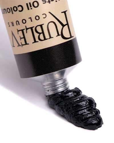
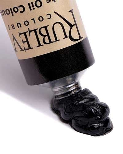
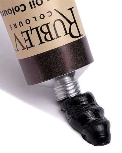
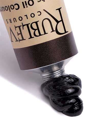
Chromatic black refers to a complex, rich black hue achieved by mixing complementary colors instead of using a single black pigment. This technique creates a black that some perceive as having more depth and subtlety, often perceived as warmer or cooler depending on the mix.
Exploring the Depth of Chromatic Black in Painting: A Comprehensive Guide for Artists

In the diverse palette of an artist, chromatic black holds a special position, particularly in the context of painting and color mixing. It's a hue that isn't just about darkness or the absence of light; it’s about depth, subtlety, and the sophisticated interplay of colors. This introduction aims to unravel the nuances of chromatic black, shedding light on its definition, properties, and significance in the world of art.
What is Chromatic Black
Chromatic black is a complex color created by mixing two or more complementary colors (colors opposite each other on the color wheel) in specific ratios. Unlike traditional black, which is often a single pigment designed to absorb all light, chromatic black is the result of a careful blend of colors that collectively absorb most wavelengths of light but still reflect some. This reflective quality imparts chromatic black with unique undertones and dimensions.
Color Notes: Chromatic Blacks
History of Chromatic Black
Early Beginnings
The concept of chromatic black in art predates modern understanding. Ancient civilizations, like the Egyptians and Greeks, often created black hues using available materials, but these were not necessarily 'chromatic' by today's standards. The Renaissance period marked a significant turning point in the use of color, where artists began experimenting more consciously with the nuances of shadow and light.
Renaissance and Baroque Periods
During the Renaissance, the understanding of color theory evolved substantially. Artists like Leonardo da Vinci and Caravaggio started exploring the depth and dimension that could be achieved through color mixing. They understood that mixing complementary colors could produce a rich, deep hue that resonated more naturally than the flat blacks made from single pigments.
18th and 19th Century Developments
In the 18th and 19th centuries, there was a further push towards realism in art, with a deeper exploration of light and shadow. This period saw the refinement of chromatic black as artists sought to capture the subtleties of the world around them more accurately. Some of the Impressionists rebelled against the use of solid blacks, favoring instead the dynamic quality of chromatic blacks. Artists like Claude Monet and Edgar Degas exemplified this approach in their work.
Modern and Contemporary Art
In the 20th century, the use of chromatic black became more varied as the art world exploded into a variety of movements. From the bold experiments of the Abstract Expressionists to the nuanced shades of contemporary artists, chromatic black has continued to be a vital tool in the artist's palette. Its ability to convey depth, emotion, and nuance has made it a favorite among artists who seek to challenge the traditional perceptions of color and light.
The Science Behind Chromatic Black
When it comes to painting, the science behind the colors and the materials used is often overlooked. However, understanding the scientific principles behind the creation and application of paints can greatly enhance an artist’s work. One particular area of interest is chromatic blacks, which are mixtures of various pigments designed to create a deep, rich black color with subtle undertones. Are chromatic blacks useful in art? How do they differ from black pigments, such as carbon black and iron oxide black? That’s what we’ll learn in this video.
Definition of Blackness
Black is a color that results from the complete absorption of visible light. Carbon black manufacturers promote carbon black pigments that absorb up to 99.98% of light. The higher the light absorption by an object, such as black paint, the higher the blackness value (My). Blackness is the lightness of a sample without considering the colored undertone.
Definition of Jetness
Deep black coatings can have an undertone – bluish or brownish. A deep black color with a bluish undertone is perceived as richer and darker than one with a brownish undertone. Two paint samples with the same blackness value (My) and different undertones (dM) can be perceived as different blacks. The sample with a blue undertone will be perceived as deeper black. As the undertone of a black color impacts the visual perception of the color black, the hue-dependent degree of blackness is called “Jetness” (Mc).
Understanding Light and Color Perception
Light consists of electromagnetic radiation that can be detected by the human eye. Visible light is usually defined as having wavelengths between 400 and 700 nanometers, between the infrared and the ultraviolet light. Invisible to human vision, ultraviolet light has short wavelengths below 400 nanometers. As the wavelengths become longer, we perceive them as violet light above 400 nanometers. So, we perceive that particular electromagnetic radiation as violet light. And as the wavelengths get longer into 450 nanometers, we perceive them as blue. As we move up to 500, we perceive it as green. Yellow and orange are between 570 and 620. Red wavelengths of light occur above 620 nanometers, and as we approach 700, we are in the infrared, which is no longer visible to human eyesight.
Reflectance and Perception of Ultramarine Blue
Why is this important? We can measure and quantify the light reflected from paint rather than relying solely on our perception. To understand this, let’s look at the light reflected from samples of a popular artist’s color—ultramarine blue. This graph shows the spectrum of wavelengths of light we perceive as different colors, from violet to red. The graph contains four colored lines. The bottom two lines represent two different ultramarine blues—a green and red shade—at full strength. The two curved lines above these are the same ultramarine blue mixed with titanium white. Ultramarine blue at full strength does not reflect much light and appears dark, represented by the lines near the bottom of the graph with a low percentage of light reflectance. When mixed with titanium white, they reflect more light, presented by the higher percentages of the curved lines on the graph.
When mixed with titanium white, Ultramarine blue reflects more light in the blue wavelengths denoted by the curve. Much less light is reflected in the green and the yellow areas of the spectrum. However, we can also see more light reflected in red wavelengths, indicated by the curve ascending in the 700-nanometer wavelengths. The curve indicates the red bias of ultramarine blue that we recognize as the typical appearance of this color.
Perceptions of Blackness and Jetness
Now, let’s apply what we’ve learned to black colors. When we measure the amount of light reflected by black, the percentage is very small, so the line representing that reflectance is in the bottom part of the graph, typically below five percent. We define blackness as colors with less than five percent reflectance, usually much less than that.
It is difficult to perceive colors at this low level of light reflectance, but we can perceive bluish or brownish blacks. Black with a bluish undertone is perceived as richer and darker than black with a brownish undertone. Remember, this is how we define “jetness”. If you have a black with less jetness, it is a black that has a brownish undertone.
Color Wheel and Color Combinations
Let’s arrange the colors of varying wavelengths of light in a circle, commonly known as the color wheel. This wheel helps us comprehend how different color combinations can produce new colors by absorbing lightwaves when paint is mixed. When two or more colors are combined, they absorb more lightwaves, reflect less light, and appear darker.
To create chromatic black, we mix complementary colors. This is because a single color pigment cannot absorb all the lightwaves across the spectrum. When we mix two or more pigments, they absorb more light. For instance, if we mix blue with its complementary color, orange, such as burnt sienna, we get a chromatic black. The two reflectance curves show that lightwaves on different parts of the spectrum are absorbed. Burnt sienna absorbs blue lightwaves, while ultramarine blue absorbs orange and red lightwaves.
Mixing Chromatic Blacks
There are many different ways of mixing chromatic blacks. What we discussed is a chromatic black made by mixing complementary colors. Another method is to use a Split Complementary. You start with one color, then go to the opposite side of the color wheel, and add two adjacent colors from the complementary color of the first one. In this case, the base color is yellow, and its complementary color is violet. We move to the adjacent colors, and that’s a split complementary.
There are more ways to create chromatic blacks. One involves using a triadic color scheme, where you select three colors evenly spaced around the color wheel as a triangle.
Another method uses a tetradic color scheme, which involves choosing four colors arranged in a rectangle or tetrad. By blending these colors, you can also create chromatic blacks. These methods provide alternative options to achieve black hues without using pure black pigment.
Comparison of Chromatic Black Paints
Now, let’s examine chromatic black paints. These are convenience mixtures or hues. They are hues because the paint is not a single pigment color but a blend or mixture of pigments. The first we will examine is Gamblin Chromatic Black, which consists of two pigments, quinacridone magenta, PV 19, sometimes also called quinacridone violet, and phthalocyanine green, PG 36. These pigments represent a complementary color mixture to achieve black.
The second chromatic black is Utrecht Chromatic Black. This paint contains four pigments: quinacridone magenta, Prussian blue, PB 29, nickel azo yellow, PY 150, and, interestingly, zinc oxide, PW 4. These pigments represent a triadic color mixture.
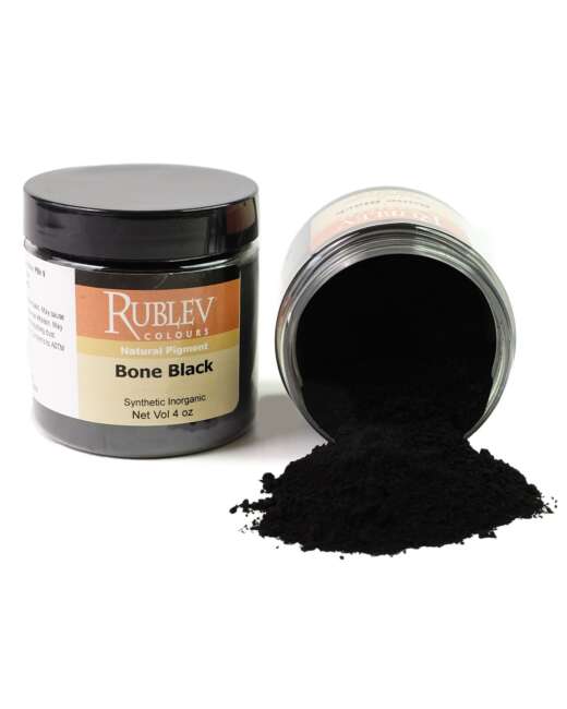
Let’s compare these chromatic blacks with three different black pigments. The first is ivory black, more appropriately named bone black, PBk 9. The next one is Roman black, an iron oxide earth pigment, PBk 11. The third is lamp black, PBk 6. Lamp black is pure carbon and is typically one of the darkest blacks in the range of artists’ colors.
Reflectance of Lamp Black, Roman Black, and Bone Black
To compare these colors, let’s return to our reflectance chart of visible wavelengths of light. When measuring the light reflected from a sample of titanium white, it is represented by a line that is essentially flat near the top of the graph, close to 100%. Titanium white reflects about 95% of the light across every wavelength. On the other hand, black colors only reflect a small portion of the light across all of the wavelengths, which you can see in this graph of three black pigments: Lamp black, Roman black, and bone black. The differences in the lines of this graph, which are less than one percent, are so slight they are nearly impossible to see by visual comparison.
Comparing Gamblin and Utrecht Chromatic Blacks
When we compare lamp black with the two chromatic blacks from Gamblin and Utrecht, we see that they are flat lines but have bumps at different locations along the light spectrum. Again, the differences are slight and difficult to see by visual comparison.
We need to increase the amplitude of light reflectance along the line to see the differences visually. To do this, we mix each of the colors with white. When we mix black with white pigments, we get grays, and the undertone of the grays becomes much more easily perceived by our eyes.
Lamp black has a bluish undertone, typical of most lamp black pigments, although there are lamp blacks with a brownish undertone. Lamp blacks with a bluish undertone are perceived as deeper, richer blacks or have more jetness than those with a brownish undertone. Bone black mixed with titanium white tends to have a less bluish undertone, and Roman black has even less. The undertone is seen in the graph, where the slope in the blue end of the spectrum represents the bluish undertone.
When we compare the Chromatic Blacks mixed with titanium white to the lamp black, we see the differences in their colors. The bumps in the lines for Gamblin Chromatic Black show the effect of the green pigment in this mixture, as seen by the bump in the curve in the green area of the spectrum. Utrecht Chromatic Black shows less dramatic change in the curvature of the line. Still, it reveals a bias toward the violet end of the spectrum, likely due to quinacridone violet in this mixture.
Common Misconceptions about Chromatic Black
In the world of art, particularly in painting and color mixing, chromatic black often falls prey to various misconceptions. These misunderstandings can significantly influence how artists use or avoid this unique color. This section aims to address these myths, providing clarity and insight into the true nature of chromatic black.
Debunking Myths
Myth 1: Chromatic black is just a fancy name for regular black.
Fact: Chromatic black is distinctly different from standard black pigments. It is created by mixing complementary colors, resulting in a black with depth, subtlety, and sometimes a hint of color, depending on the light and angle. This complexity is not achievable with single-pigment blacks like Mars or Ivory black.
Myth 2: Chromatic black is harder to use than regular black.
Fact: While chromatic black does require an understanding of color theory and mixing, it's not inherently more difficult to use. In fact, its versatility can offer more control over the tonality and temperature of the black in a painting, which can be advantageous.
Myth 3: Chromatic black makes paintings look muddy
Fact: When mixed and used correctly, chromatic black can enhance the richness and depth of a painting. The key is in understanding the balance and proportion of the colors used to mix the black. Proper use of chromatic black adds nuance and dimension rather than muddiness.
Myth 4: Using chromatic black is a modern trend
Fact: The concept of mixing colors to achieve a richer black has been around for centuries. Masters like Rembrandt and Velázquez often mixed their own blacks to achieve the desired depth and hue. The term 'chromatic black' might be modern, but the practice is deeply rooted in art history.
Myth 5: Chromatic black doesn’t exist in nature
Fact: Nature rarely presents absolute black. Most blacks in nature are chromatic to some degree, resulting from the absorption and reflection of light in various ways. Artists mimicking these natural blacks often turn to chromatic black for its realism.
Facts about Chromatic Black
Fact 1: Chromatic black can offer greater depth in paintings.
Chromatic black, due to its composition, can provide a sense of depth and dimension in paintings that single-pigment blacks cannot. This quality makes it particularly useful for creating the illusion of space and volume, especially in more realistic or representational art.
Fact 2: Chromatic black is customizable
One of the most significant advantages of chromatic black is its customizability. Artists can alter the mix to suit the specific needs of their painting, whether they need a cooler tone, a warmer hue, or a specific level of transparency.
Fact 3: Chromatic black enhances color harmony.
Using chromatic black can contribute to the overall color harmony of a painting. Since it is derived from other colors in the palette, it inherently complements those colors, creating a more cohesive and balanced composition.
Fact 4: Chromatic black can reflect the artist’s intent.
The choice to use chromatic black can be a deliberate one to convey a certain mood or atmosphere in a painting. This choice reflects the artist’s intent and can be used to subtle or dramatic effect, depending on the desired outcome.
Fact 5: Chromatic black is a tool for learning color theory.
For artists, especially those still learning color theory, experimenting with chromatic black can be an educational experience. It encourages a deeper understanding of how colors interact, how they can be manipulated, and how they influence the perception of a painting.
Chromatic black holds a unique place in the art world, particularly in the realms of painting and color mixing. Dispelling common misconceptions about this color allows artists to more fully appreciate and utilize its potential. Understanding the facts about chromatic black opens up new avenues for creative expression and technical mastery in art.
Comparing Chromatic Black to Other Black Pigments
In the realm of painting, the choice of black pigment significantly impacts the overall composition and perception of the artwork. Chromatic black, a hue created by mixing complementary colors, presents a stark contrast to traditional black pigments derived from single sources. Understanding these differences is crucial for artists to make informed choices in their work.
Traditional Black Pigments
Traditional black pigments, such as Mars Black, Ivory Black, and Lamp Black, have been staples in artists' palettes for centuries. Derived from various sources – burnt animal bones, carbon black, and vine char – these pigments offer a deep, solid black. Their main characteristic is the uniform absorption of light across the spectrum, resulting in a flat, opaque appearance.
Chromatic Black in Painting
Chromatic black, in contrast, is not a single pigment but a combination of multiple pigments. Typically created by mixing complementary colors like ultramarine blue and burnt sienna, chromatic black offers a richness and complexity unattainable with traditional blacks. This complexity is due to the varied light absorption and reflection properties of the mixed pigments, resulting in a black with subtle undertones and dynamic quality.
Key Differences
Depth and Dimension
One of the primary differences between chromatic black and traditional black pigments is the depth and dimension they impart. Chromatic black tends to have a more nuanced and vibrant appearance, providing a sense of depth in paintings. Traditional blacks, while deep, can often appear flat and may not interact as dynamically with other colors.
Undertones and Temperature
Chromatic black typically has undertones that reflect its constituent colors, which can be warm or cool depending on the mixture. This adds a level of complexity and temperature variation not present in traditional black pigments. For instance, a chromatic black mixed from ultramarine blue and burnt umber will have a cooler undertone than one mixed from alizarin crimson and viridian green.
Transparency and Opacity
The transparency of chromatic black can vary based on the pigments used and their ratios. Some combinations can produce a semi-transparent black, offering unique layering possibilities. In contrast, traditional black pigments are generally more opaque, providing solid coverage but less versatility in layering and glazing techniques.
Interactivity with Other Colors
Chromatic black interacts more harmoniously with other colors in a palette, as it shares common elements with those colors. This interaction allows for more cohesive and integrated color schemes in paintings. Traditional black pigments, lacking this inherent compatibility, can sometimes dominate or dull other colors in a composition.
When to Use Each
Chromatic Black for Depth and Realism
Chromatic black is ideal in paintings where depth, realism, and a natural appearance are desired. Its ability to provide subtle gradations and a rich, dynamic quality makes it suitable for detailed work, landscapes, portraits, and any composition where a nuanced approach to black is necessary.
Traditional Black for Boldness and Contrast
Traditional black pigments are best used when boldness and high contrast are required. They are ideal for creating stark silhouettes, and strong shadows, and in compositions where a powerful, unyielding black is necessary. Their opacity also makes them suitable for covering large areas efficiently.
Combining Both for Versatility
Experienced artists often combine both chromatic and traditional black pigments in their work. This approach allows for greater versatility – using chromatic black for nuanced shading and depth, and traditional black for areas where a solid, uniform appearance is needed.
The choice between chromatic black and traditional black pigments is not just a matter of preference but a strategic decision based on the desired outcome of a painting. Each type of black brings its unique qualities and interactions with other colors, influencing the overall mood, depth, and realism of the artwork. By understanding and leveraging these differences, artists can greatly enhance the expressiveness and impact of their paintings.
Innovative Uses of Chromatic Black in Painting and Color Mixing
Chromatic black, a hue achieved not from a single pigment but through a mixture of various colors, holds a pivotal position in the artist’s palette. Its use has transformed over centuries, particularly in the realms of painting and color mixing. This section delves into the innovative applications of chromatic black in these areas, shedding light on its evolving role and significance.
The Genesis of Chromatic Black in Artistic Practice
The concept of chromatic black emerged as artists began exploring beyond the boundaries of traditional pigments. Historically, black was often a straightforward, singular pigment like ivory or Mars black. The Renaissance period saw a shift, with artists like Rembrandt and Velázquez subtly mixing colors to achieve deeper, richer blacks. This practice laid the groundwork for the more deliberate creation of chromatic black.
Chromatic Black and the Impressionists
The Impressionist movement marked a significant turn in the utilization of chromatic black. Artists such as Claude Monet and Edgar Degas eschewed the use of pure black, instead opting for a mix of deep colors to create a more vibrant, dynamic form of black. This was not merely a stylistic choice but a fundamental change in how black was perceived – as an active, integral part of the color spectrum rather than a mere shadow or absence of light.
Techniques of Mixing Chromatic Black
The art of mixing chromatic black involves combining complementary colors – those opposite each other on the color wheel – to achieve a black that has a depth and subtlety unattainable by standard black paints. Common mixtures include ultramarine blue and burnt sienna, or alizarin crimson with viridian green. The exact hues and proportions can significantly affect the final outcome, allowing artists to tailor the black to specific needs.
Influence on Modern Painting
In modern art, the use of chromatic black has become a staple for artists looking to add complexity and nuance to their work. Abstract Expressionists, in particular, utilized chromatic black to convey a range of emotions and concepts. For instance, Rothko’s use of chromatic blacks contributed to the profound emotional resonance of his large color fields.
Chromatic Black in Contemporary Art
Contemporary artists have continued to push the boundaries of chromatic black, using it not just for its visual qualities but also as a means of conceptual expression. In contemporary practice, chromatic black is often used to challenge traditional notions of space, depth, and form.
Role in Color Theory and Education
The innovation of chromatic black has also influenced the teaching of color theory. Art instructors emphasize the importance of understanding color relationships and mixing to achieve desired hues, with chromatic black serving as a key example of how complex and varied the process can be.
Chromatic Black in Various Artistic Mediums
While primarily associated with oil painting, chromatic black has found its way into various mediums, including watercolor, acrylics, and even digital art. Each medium offers a unique interaction with chromatic black, providing artists with diverse avenues for exploration and expression.
Environmental and Health Considerations
With growing awareness of environmental and health concerns, many artists are turning to chromatic black as a safer, more sustainable option. By mixing their own blacks, artists can avoid some of the toxic substances found in pre-made black paints.
Chromatic Black in Artistic Restoration and Conservation
Art conservators have increasingly employed chromatic black in restoration work. Its versatility allows for more accurate color matching in the restoration of aged or damaged artworks, ensuring the preservation of the original artistic intent.
Future Directions
The future of chromatic black in painting and color mixing appears promising, with ongoing explorations into new pigments and mixing techniques. Digital technology, too, is playing a role in expanding the possibilities of how chromatic black is used and perceived in the art world.
Chromatic black represents more than just a color; it embodies the evolution of artistic practice and theory. Its innovative use in painting and color mixing continues to inspire artists, allowing for an expression that transcends traditional boundaries and opens new horizons in the art world. As we move forward, the exploration and application of chromatic black will undoubtedly continue to play a significant role in artistic expression and innovation.
Frequently Asked Questions
What does chromatic black mean?
What is a chromatic black?
A chromatic black is a shade of black created by blending complementary colors in painting, rather than using a standard black pigment. This results in a more nuanced and vibrant black that can vary in tone and warmth.
What colors make chromatic black?
Chromatic black is typically made by mixing complementary colors such as blue and orange, red and green, or yellow and purple. The exact shades and proportions can vary, giving different nuances to the resulting black. In the nineteenth century, English colormen, such as Winsor & Newton made chromatic black from ultramarine blue and burnt sienna.
Is chromatic black transparent?
Chromatic black can vary in transparency depending on the pigments used and their proportions. Some mixtures may produce a more opaque black, while others can result in a slightly transparent effect, offering unique layering possibilities in painting.
What is chromatic black oil paint?
Chromatic black oil paint is an oil-based paint made by mixing complementary colors to create a deep, rich black. This type of paint is preferred by artists who want black with more depth and character than standard black oil paints.
How do you make chromatic black oil paint?
To make chromatic black oil paint, mix complementary colors such as ultramarine blue and burnt sienna, or alizarin crimson and viridian green. The key is to adjust the proportions until a rich, deep black is achieved.
What is the difference between black and chromatic black?
The main difference is in composition and appearance. Standard black is made from a single pigment, resulting in a flat, uniform color. Chromatic black, made from mixed colors, has more depth, and subtlety, and can have undertones of other colors.
What is the lightest shade of black?
The lightest shade of black, often referred to as "off-black," can be achieved by slightly lightening black paint with a touch of white or a complementary color. This creates a softer, less intense black, ideal for adding depth and dimension in paintings without overwhelming other colors.


