Painting Flesh Tones with the Human Palette

The revival of traditional art styles and techniques has burgeoned into a full-fledged Second Renaissance. And this re-awakening has sparked a renewed interest in the colors used by the great masters of the past. It was thus inevitable that someone would produce the traditional pigments in watercolors.
When Rublev Colours Watercolors hit the market, I was fortunate to be the first author to write about it. In the April 2006 issue of Watercolor Artist (formerly Watercolor Magic), I introduced the Rublev Colours line of watercolors to the magazine’s readers. To exemplify the Rublev Colours Watercolors, I used the three following illustrations.
The first illustration is a small color study in flesh tones (Fig. 1). At the sides of this mini-portrait, you can see the colors that I used to make the flesh tones. In the upper left, you see a block of three hues. The top two are ochres. The orange one is Orange Ochre, and the blue one is Vivianite. The red hue is Cinnabar. Beneath them is the pinkish color, which I used as a foundation flesh tone for my pale Caucasian subject. This is the color with which I did the basic modeling of the forms.

Fig. 1. Watercolor flesh tone study: Left swatches (top to bottom): Orange ochre, vivianite, cinnabar, and mixture. Right swatches (top to bottom): Lapis lazuli, orpiment, vermilion, and malachite.
The blocks of colors you see on the right side of the portrait are my supplemental colors. At the top is Lazurite (also known as Lapis Lazuli). I used this clear, transparent blue to tone down—and sometimes darken—the foundation flesh tone. I also used it to paint the cool half-tone areas.
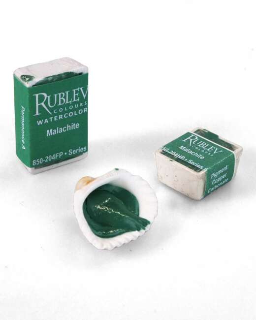
The yellow hue is Orpiment, which I thinly layered over the warmer parts of the head that are facing the primary source of light. The color below the Orpiment is Vermilion. (The subtle difference between Vermilion and Cinnabar may be too slight for you to discern in this reproduction on your screen.) I glaze this rich red hue over the most pinkish parts of the head and neck. The fourth color there is Malachite. This is a very cool and transparent green pigment, with which I glazed the reflected light within the shadow side of the head.
With that, my test portrait is complete. And it has demonstrated that this chromatic scheme will work well for painting a larger, more formal portrait. I have supplemented this picture with written notes (which you do not see here) of everything I have done. Thus this study is now an annotated visual reference with which I can consult for future paintings.
The purpose of these three illustrations is not to tell you that you should always use these particular pigments and color schemes whenever you mix your flesh tones. My intention, instead, is to show you how you can think for yourself—and decide which colors you want to use. Thus you will know how to mix flesh tones by “feel” rather than formulas.

Fig. 2. Watercolors swatches: (top from left to right) Madder lake, gamboge, and indigo; a mixture of these pigments (bottom).
The other two illustrations demonstrate more simple ways of mixing flesh tones. In the first of the two, I have used a basic primary triad (Fig. 2). My red is Madder Lake. The yellow is gamboge, and the blue is Indigo.
I like to make flesh tones with primary triads (red, yellow, and blue) and with dyads of complementary colors as well. These examples show you what I mean. The three colors at the top are Madder Lake, Gamboge, and Indigo. (These are genuine pigments and not “hue” replacements.) I made the flesh tone continuum beneath them by stirring these three primary colors together. This is not a simple tonal value scale, though, because I increased the ratio of blue as the mixture darkens on the right. In other words, the darker it is, the more blue it has in it.
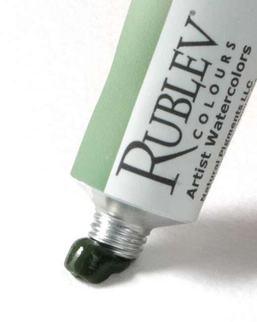
The two colors in the following illustration are a dyad of earth pigments (Fig. 3). (Earth colors often make excellent, realistic-looking flesh tones.) The red is Red Sartorius Earth. And the green is a type of Celadonite, a green earth color, with the name Verona Green Earth. Celadonite is very transparent and is an excellent green for making flesh tones.

Fig. 3. Watercolors swatches: (top from left to right) Red Sartorius earth and Verona green earth; a mixture of these pigments (bottom).

